
This is an exploratory UX study that I conducted. This study seeked to understand and examine the current structure of the site and how accessible it is to users (students). It also proposes ways to improve the structure of the site to enhance user experience.
The visuals on this page are from my UXR report designed to showcase my reporting ability.
phase 1
UNDERSTANDING
BACKGROUND AND GOALS
The student portal website OASIS, is known for its design flaws, especially on the financial charges page. These errors allow for many to not understand their charges and possible financial assistance, as well as caused many to miss their payments simply because they didn’t know they had one.
As a result, a research topic was proposed on the structure of the site based on two facets:
Usability: Understand and examine the current structure of the site and how accessible it is to users (students).
Design: Assess how to better the site and create a better experience for those who rely on it for billing information.
METHODS
To achieve these goals, I decided to adopt a variety of attitudinal and behavioral data from target users. An initial form was conducted, complete with survey questions, tree tests and card sorts to record user understanding. Based on user needs, a prototype landing page was created and a follow up form with A/B concept testing was conducted to fully understand what qualities need to be employed.

Survey
I surveyed a representative sample of USF Students and their comfortability with the student portal OASIS, and specifically the funding page. I asked them questions about their grades in school, to create an experience level range and then asked about their relationship with the site and the representative page.

Card Sorting
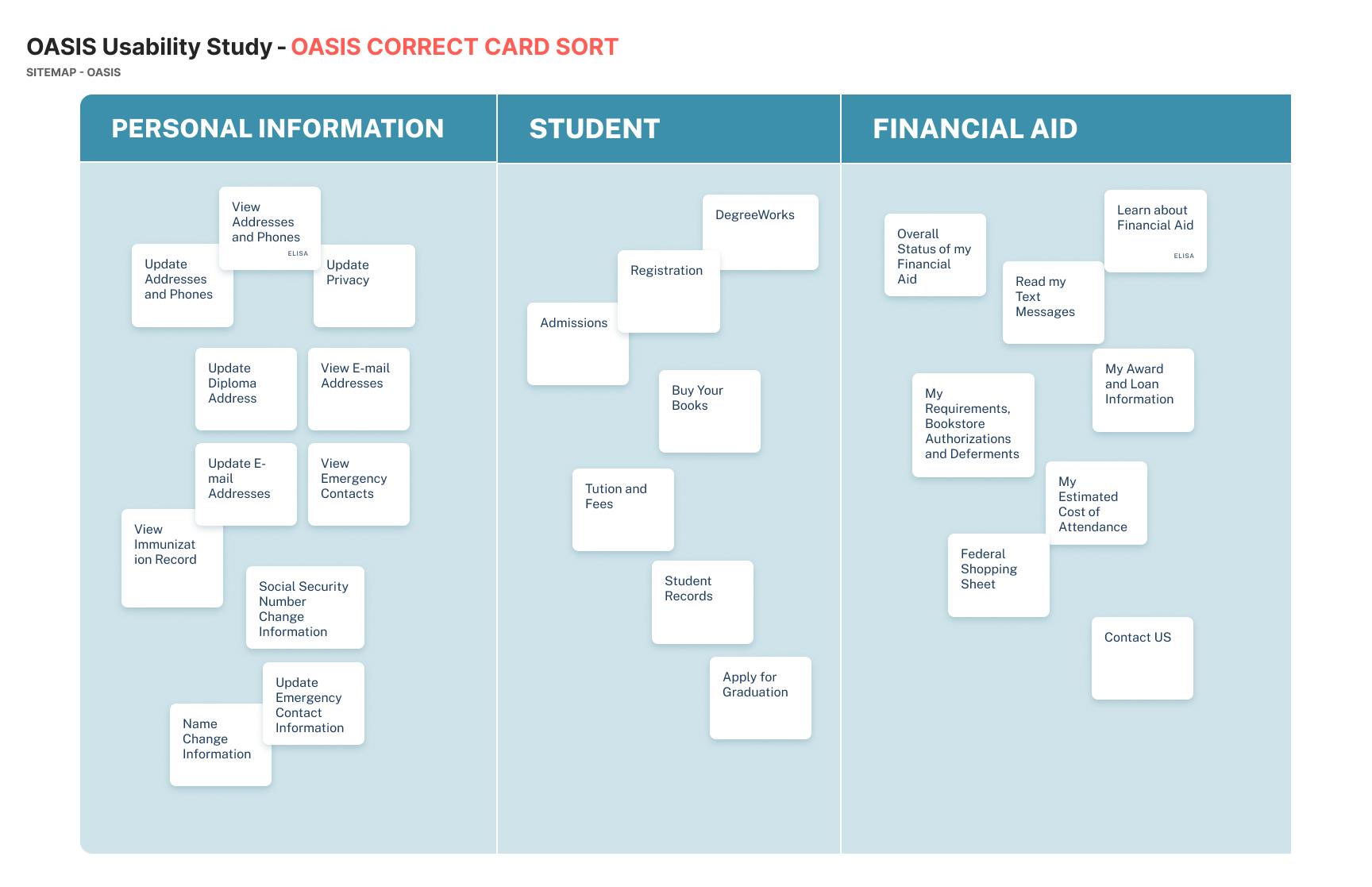
To evaluate user’s view of the student database structure, a card sort was also asked of them to evaluate where each of them think each item should go.
Participants took the existing categories found in the original site structure and categorized them in the order that made the most sense to them.

Tree Testing
To evaluate the usability and the effectiveness of the site and the menu order, I gathered the sample of participants to complete a tree test based on the original hierarchical category structure, or tree, by having users find the locations in the the tree where specific tasks can be completed.

A/B Concept Testing
Based on the survey and Tree Testing/Card Sorting evaluations, a mockup of the potential structure change for the student database was shown to the participants.
The user’s potential response to the new site was then recorded as evaluated as attitudinal research for the final iteration design.
CRITERIA:
- Current USF Students
- Variability within the classifications of year
- Awareness of the site/financial aid
What I got: 15 OASIS users (2 freshman, 4 sophomores, 5 juniors, 4 seniors)
TIMELINE:
- Planning: 2 days
- Recruiting and Screening: 2 days
- Analysis and Report: 4 days
- Delivery: 1 week
Tools: Google Form, Google Sheets, Photoshop, OptimalWorkshop (Tree Sort and Card Sort), Figma, Excel
Based on the Survey, I was able to create an empathy map that showed the participants feelings towards the current site.
Empathy Map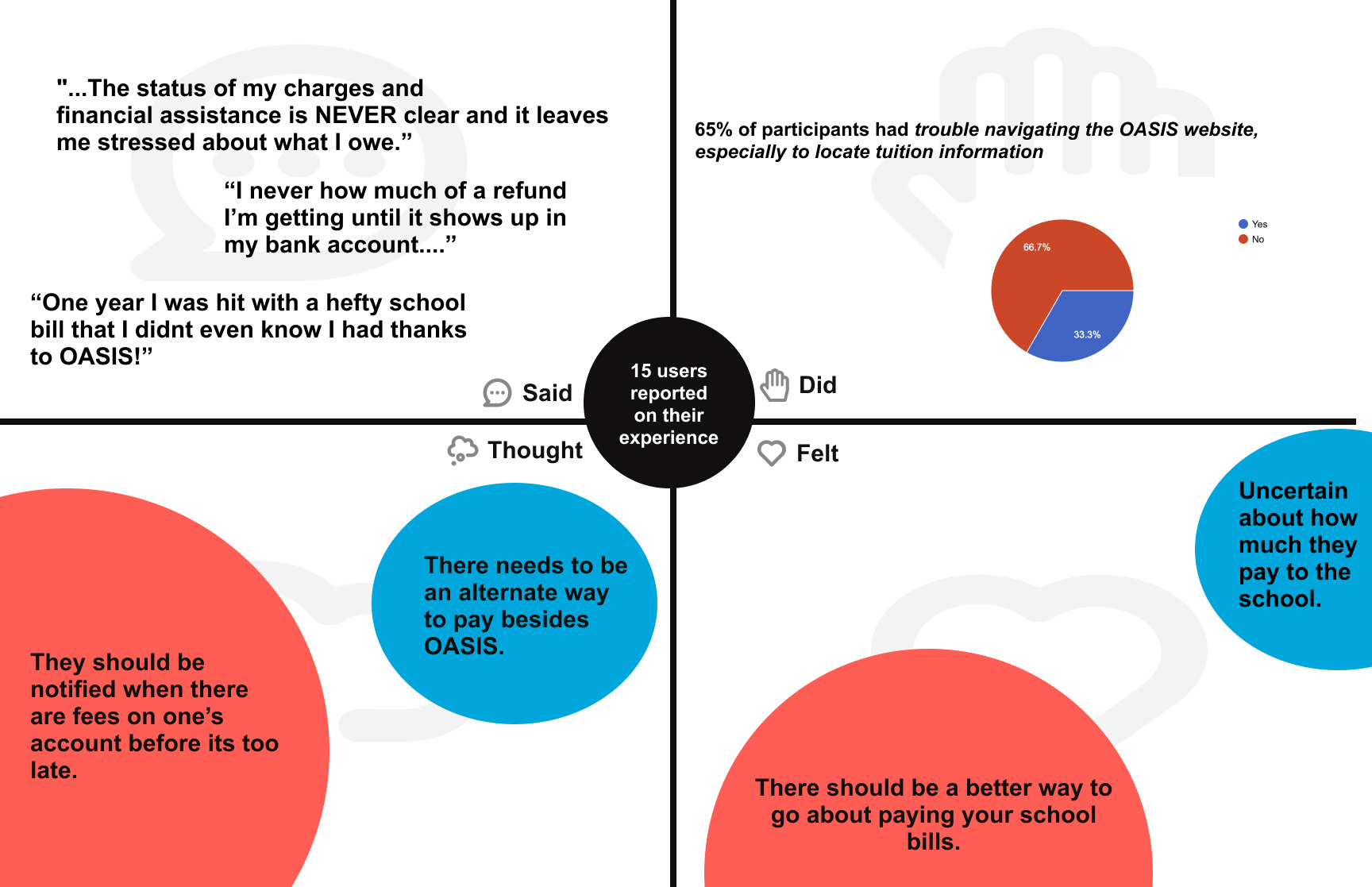
TAKEAWAY FROM THE EMPATHY MAP
- There is trouble with the OASIS navigation when it comes to locating the tuition information, which can lead to uncertainty and anxiety about knowing when your payments are due and how to pay it.
- There is anxiety about the lack of payment breakdown leaves students and other people alike in the dark, which instead leaves them more nervous.
phase 2
DEFINING THE SOLUTION AND FINDINGS
IDEATION
In order to execute a design solution, first I had to see where the user’s heads were at when trying to navigate to the certain section of the page.
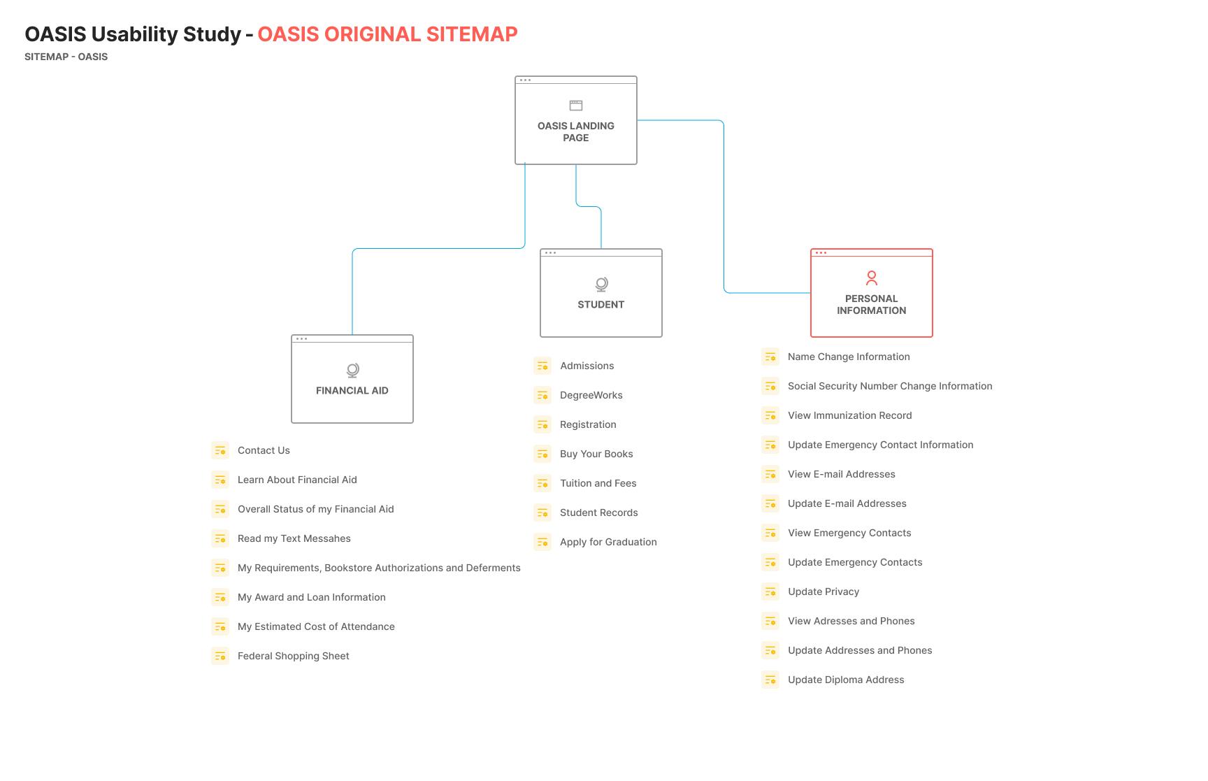
First, a sitemap of the original site was created and used as a basis for the Tree Test and Card Sorting Exercises.
WHY USE BOTH CARD SORT AND TREE TEST?
The current OASIS site is very unintuitive to find where to pay and how much a student owes. Through the initial interview, it was apparent that the site both had a problem with its navigation to certain elements, as well as placement in confusing categories within the menu page. Using both the tests helps to define the solution of completely rehauling the page rather than just creating minute changes.
INITIAL USABILITY TESTING
To test the usability of the site, these test were implored to see if getting to the action task was accessible for most users.
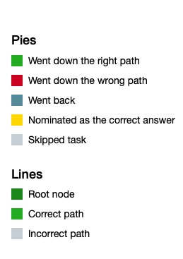
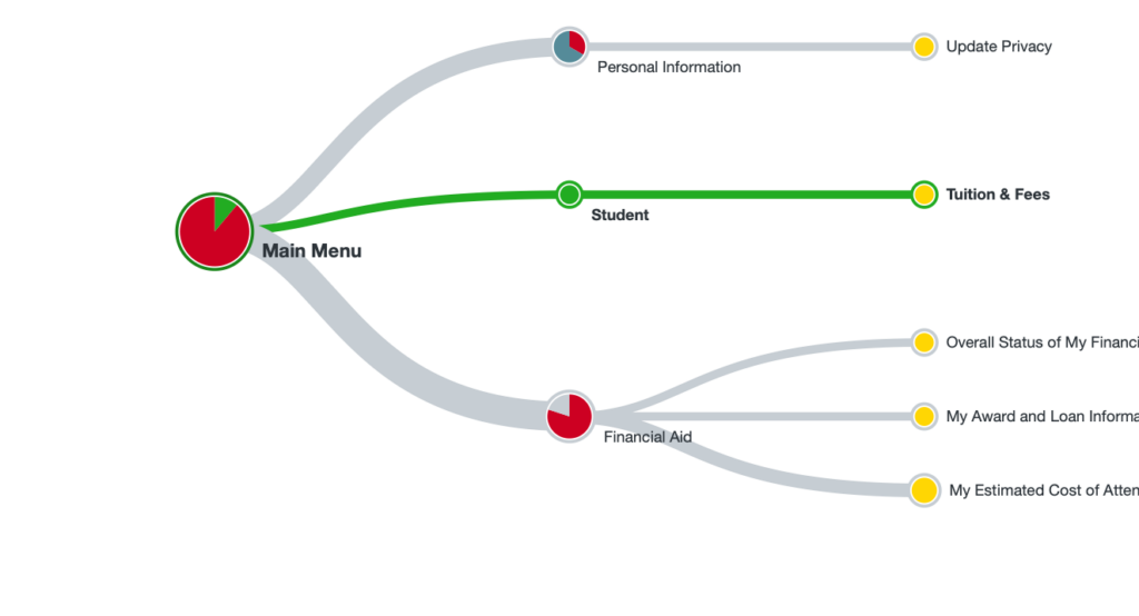
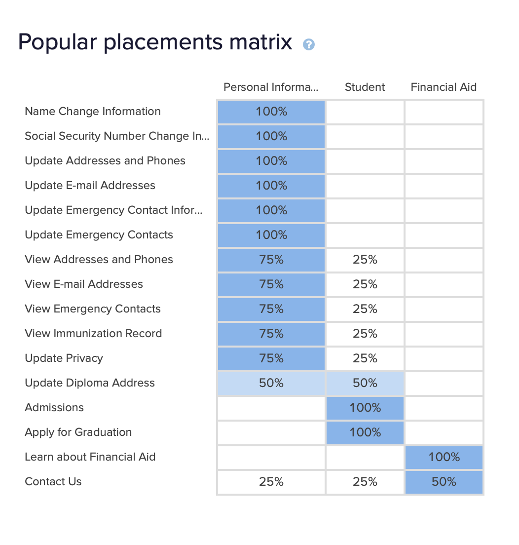
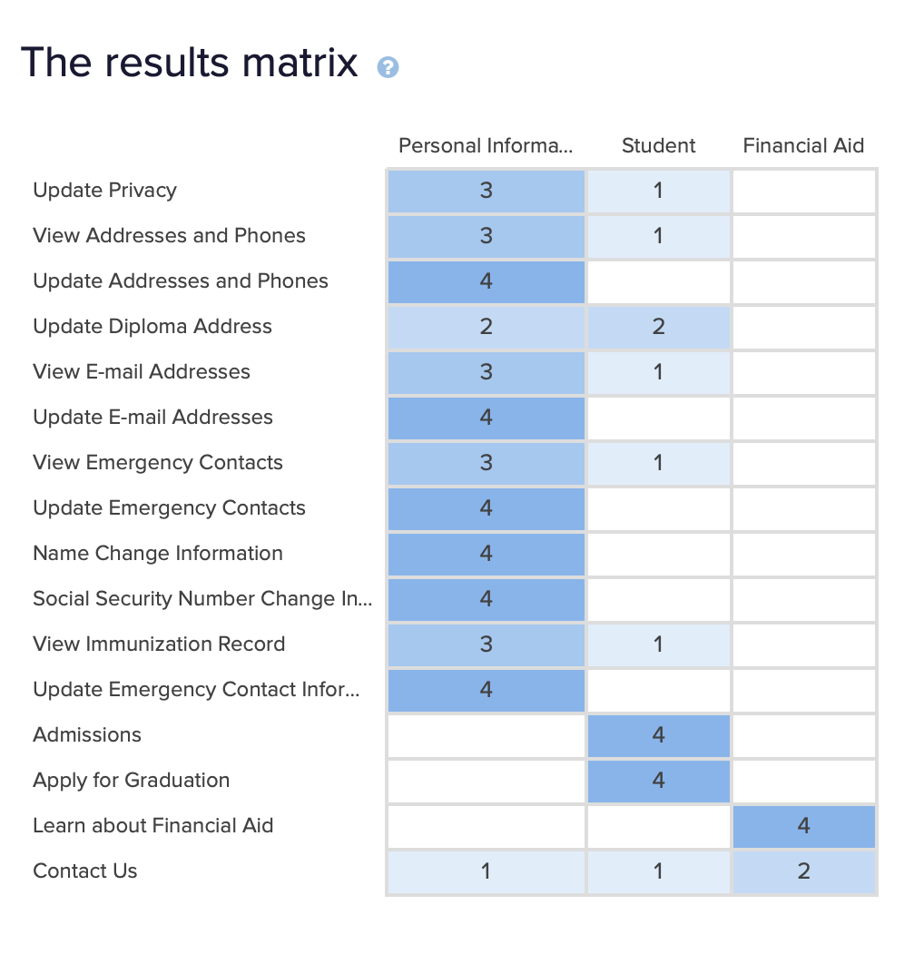
Through the Tree Test and Card Sort Results, there is a low chance of success when it comes to navigating the target tasks on the current layout of the site.
CRUCIAL INSIGHTS
SITE PAIN POINTS:
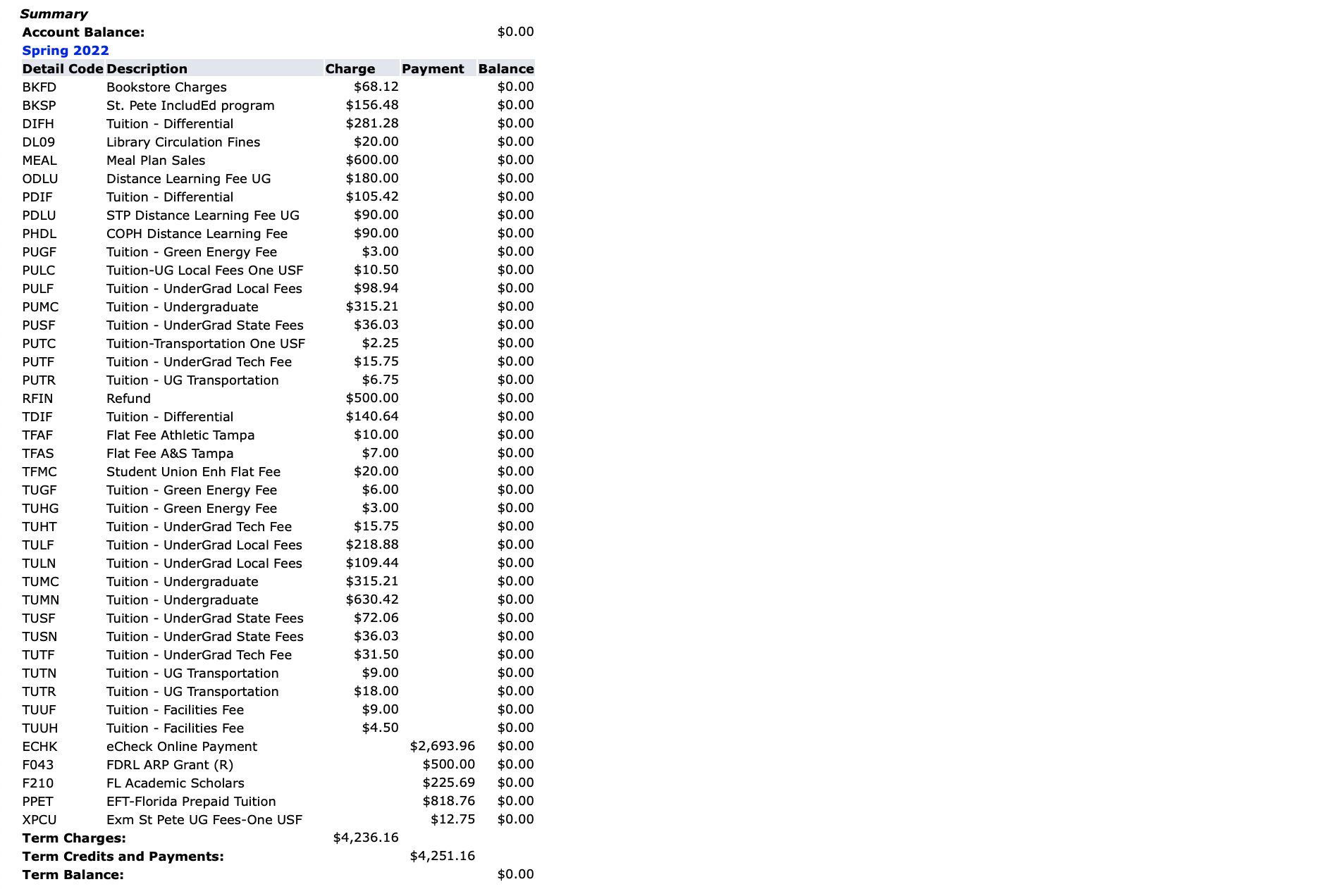
- The current design of the billing on OASIS does not provide a clear and detailed breakdown of the costs and thus can leave students confused with a debt they didn’t think they had.
- There is an assumption the site is showing a summary of charges, when it was actually the start of the detailed charges.
- Total amount was hard to see and determine.
- Financial Assistance/reduced payment info was hard to find.
- Through both tests, it would be more intuitive to find the payment section in the FINANCIAL AID section rather than the STUDENT section
phase 3
DESIGN
PROTOTYPE
WIREFRAMES:
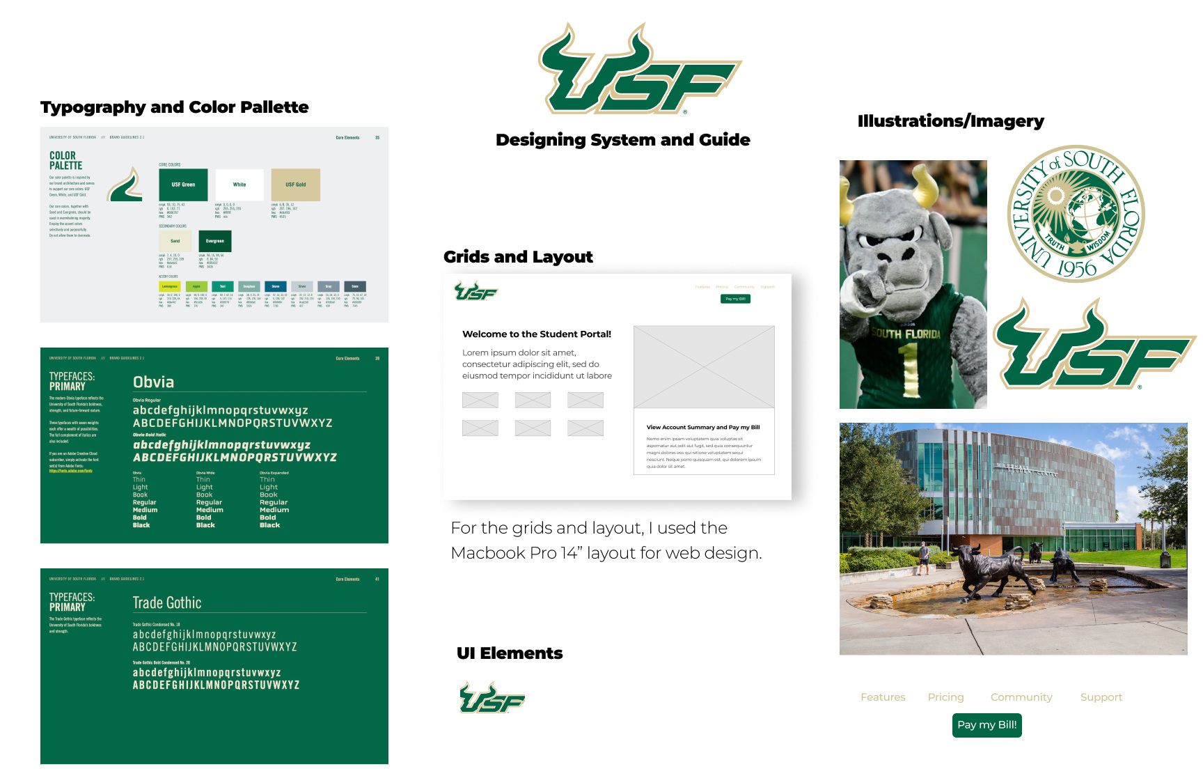
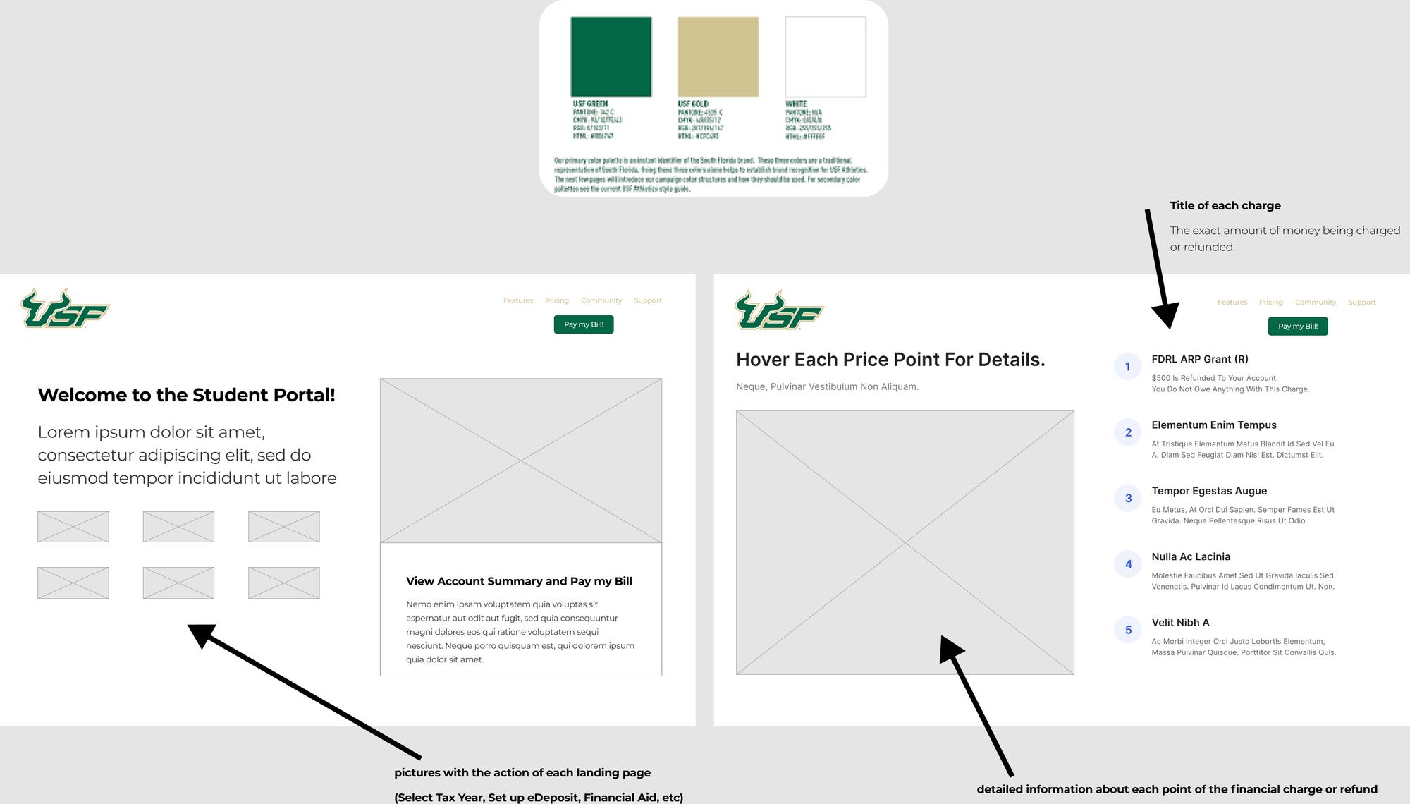
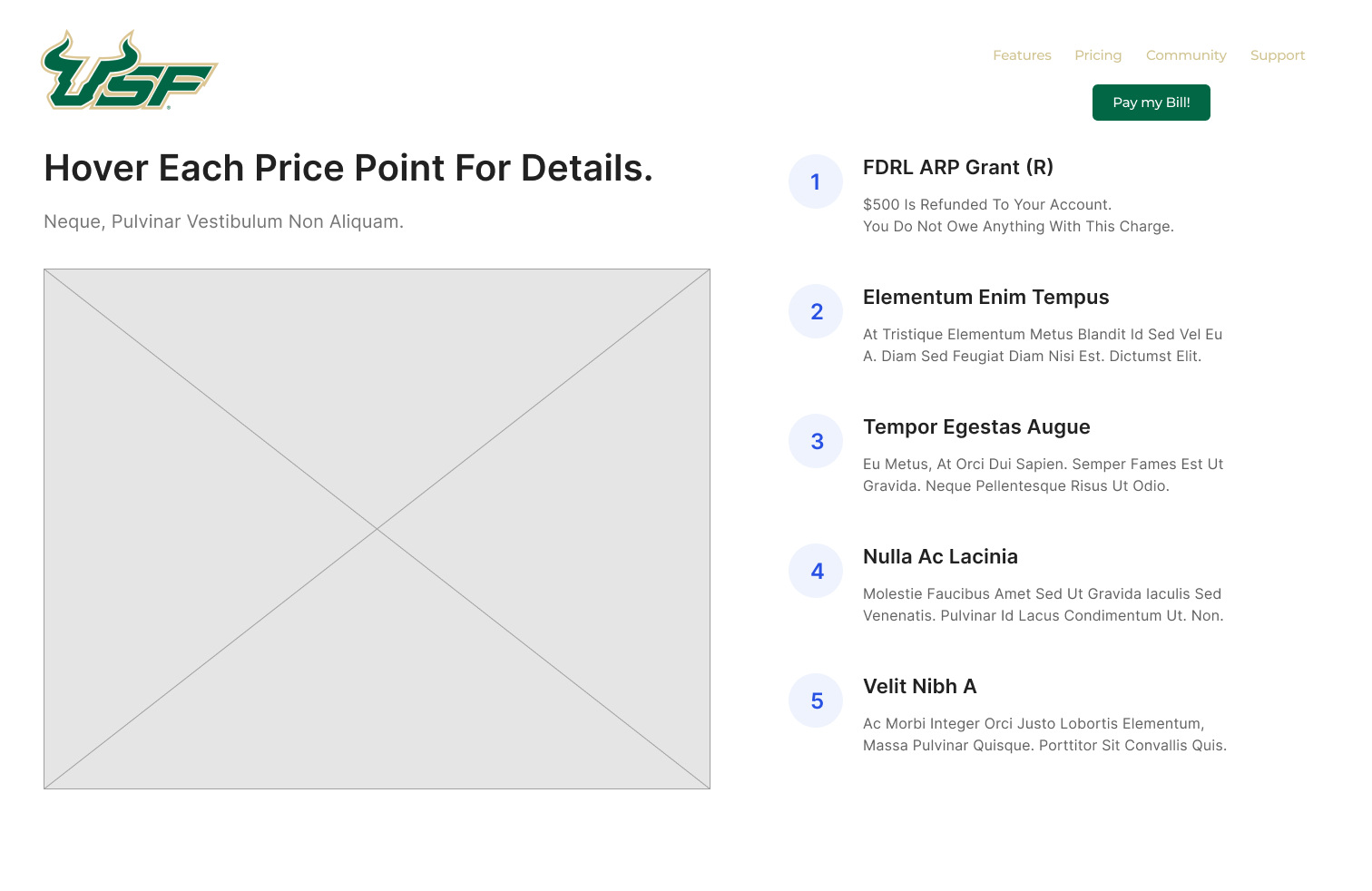
I created mid fidelity wireframes to visualize the overall vision of the revamped OASIS financial aid page and its functionalities. For a better visualization and better understanding of my design, I focused on translating three main functionalities of the improved page to the frame.
- Navigation towards the funding page
- Transparency between the charges being presented
- Allowing for an easier navigation to the payment
SECONDARY USABILITY TESTING
GOAL:
The goal of the study was to see if the functionality and design of the the OASIS homepage correlated with the ease of finding and paying the bill that is due every semester.
TEST OBJECTIVES:
- Observe how participants perform the tasks that are available on the site, and how far they are to completing the goal (ex. finding how much they how and paying the bill), as well as documenting what users would like to see improved.
- How easy is it for the participants to navigate through the site and complete the goal?
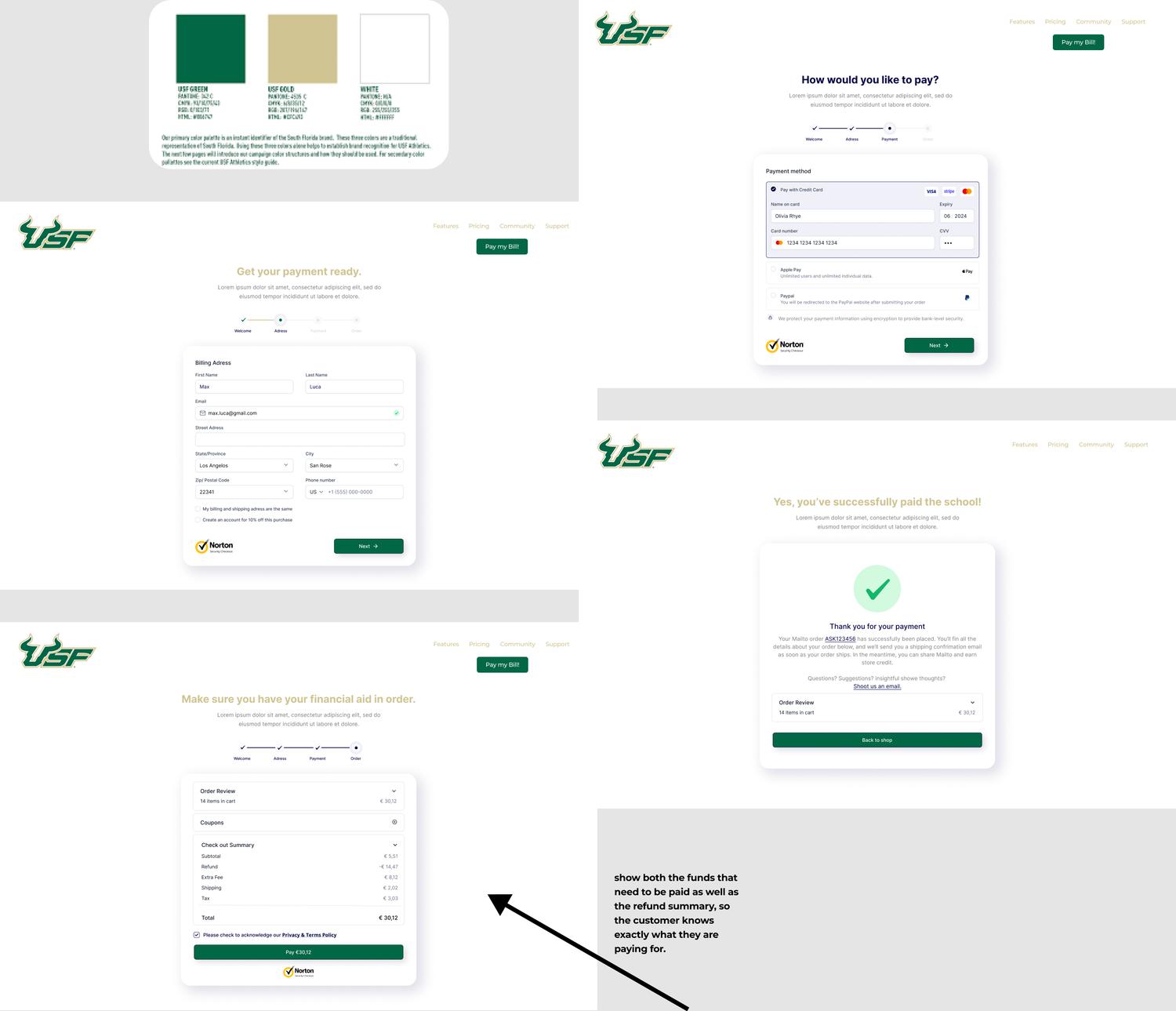
A/B TESTING OF THE FUNDING SCREENSHOTS
INSIGHTS FROM THE A/B TESTING
- Through the testing, we can see that there was a positive response to the color being added, especially the color being the same as the USF school colors
- By implementing a familiar layout, one that matches the rest of the site, there is a better feeling about landing on the page.
- Creating a site that places the importance on explaining the exact payments that need to be paid, as well as the refunds, helps to let users understand their bill on a better level.
- Relieves the anxiety that was seen in the original interview sessions, where the lack of payment breakdown leaves students and other people alike in the dark, which instead leaves them more nervous.
- Placing the pay button on every page that has to do with the payment information now creates a seamless timeline from getting the information to payment. One of the biggest complains from the original sessions was that there was no direct way to pay, leaving for confusion once again when going back to the menu.
What to fix:
The Final Iteration Design
CRUCIAL INSIGHTS
In able to update both design and usability, it is crucial to use familiar coloring and placement to not confuse the consumer. By placing the same amount of importance on the design properties with the usability of the navigation, or combing the UX and UI together, then an optimal experience can be created.
phase 4
CONCLUSIONS
WHAT WE LEARNED:
- Start a website with users in mind! Creating a page with the numbers in mind before the student creates for a site that does not meet their needs.
- Create a site as if you’re the user and want to find out your financial information!
- Without an adequate user compatibility rate with the site, then the page does not serve its purpose as a resource but instead a source for problems.
- The landing page is not just a place to dump information, but creating the right atmosphere leaves users with the information they need, without the added stress.
RESEARCH IMPACT:
Through the A/B Testing, we can see that there was improved flow and ease finding the landing and payment page. Creating a sense of familiarity as well, allowed for a more enjoyable experience, and less anxiety inducing.
STRATEGIC IMPACT:
- In able to create an ideal user experience, prioritize user comfortability before personal/company accountability.
- To establish user comfortability, use familiar color schemes or site structures from other popular pages on the site.
PRODUCT IMPACT:
- Invite a change of design of visual components on the site to allow for important things to stand out and allow for ease of the user.
- Familiar UI components, such as school symbols can allow for familiarity within the site
- Including things like buttons that link directly to payment portal can allow for the most important things to catch the user’s eye and allow for a more seamless payment session.
WHAT WE CAN STILL CHANGE:
- Due to the project being a personal one, and not part of the school officially, there was limited to no access to measure success of the new site design
- So how would I measure success?
- Look at the payment dates from students after the redesign. If the payments start coming in faster, it could show for the less confusion found when the new titles are emphasized.
- Look at the visit metrics to the page. With less confusion to how to pay, there could actually be less visits, as many are very one and done and can pay and understand in one sitting.
MY LEARNINGS:
PERSONAL GROWTH WITH CARD SORTING AND TREE TESTING
- The hardest thing that comes with partaking in new research methods is learning how to read the results. Through this project, I was able to see how a user’s process with navigation can be literally translated into data, and how paths can have a large effect on one’s user experience.
- Another thing that comes with these research methods is learning how to employ them and use them for the right purpose in your study. Through this project, I went through multiple drafts of each test, and used both to make sure that I could really understand what I was getting from my participants, and how I could use that to fuel my research on one’s experience with the sire and its navigation.
PERSONAL GROWTH WITH FIGMA
- Figma is one of the programs that I wanted to learn the most in this process. Coming from a academic research first focused background, I had limited knowledge on programs that are built to design and bring the vision that one has to life in able to propose change
- With Figma, I was also able to create the diagrams and other necessary visuals in able to push the storytelling, a component that is very important when conducing UX Research
WHAT WOULD I HAVE DONE DIFFERENT?
- Make sure that there are more participation within the tree and card sort!
- Getting a higher translation rate, can show a more fleshed out result of how users feel about the site and its navigation qualities.
- Create a site as if you’re the user and want to find out your financial information!
- Without an adequate user compatibility rate with the site, then the page does not serve its purpose as a resource but instead a source for problems.
- The landing page is not just a place to dump information, but creating the right atmosphere leaves users with the information they need, without the added stress.
Leave a Reply